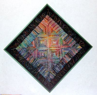
 "Faceted Spectrum" - 35"x35" - 2004
This crinkle quilt is pieced from several color-ways of a striped batik fabric (couldn't choose just one piece when they were all so "yummy"). I had cut a lot of squares, each were divided into four triangles, and then the fun of playing with arrangements began on the design board. I was delighted with the fractured log cabin block pattern that "happened".
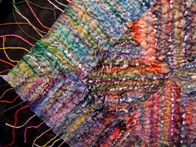
After the quilting is completed, the crinkle quilts re-enter the design process. Usually something more needs to be added or there are areas that need to be emphasized or DEemphasized. Paint or oil stick pastels are what gets used most often ... sometimes crayons. I use whichever medium will best serve the purpose to get the effect "demanded by the piece".

For this work, additional lines of silver acrylic paint emphasize the log cabin structure. Also, I used pastels to adjust colors in the stripes ... either to blend in a too prominant color, or to add another to balance the colors within a row or block or visual section of the piece. As you can imagine, this part does not go quickly. There's a lot of contemplating and looking at the work through a "viewing glass" or my favorite tool, the wrong end of a pair of binnoculars. Seeing the work through these obscures the details. Values and design lines are most visible.
After the quilting is completed, the crinkle quilts re-enter the design process. Usually something more needs to be added or there are areas that need to be emphasized or DEemphasized. Paint or oil stick pastels are what gets used most often ... sometimes crayons. I use whichever medium will best serve the purpose to get the effect "demanded by the piece".

For this work, additional lines of silver acrylic paint emphasize the log cabin structure. Also, I used pastels to adjust colors in the stripes ... either to blend in a too prominant color, or to add another to balance the colors within a row or block or visual section of the piece. As you can imagine, this part does not go quickly. There's a lot of contemplating and looking at the work through a "viewing glass" or my favorite tool, the wrong end of a pair of binnoculars. Seeing the work through these obscures the details. Values and design lines are most visible.
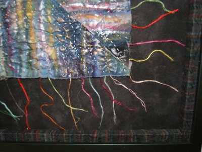
 The quilts are "shadow-boxed" within the frame. Initially, this was so the glass would not crush against the quilt. I cut and stack strips of foam core which are then covered with fabric. These now serve the purpose as an additional design transition between the frame and the quilt (the fabric matting is the other). The fabric that covers those strips for this one is the "other" (wrong) side of a black mono-stripe. The color is added with pastels.
I'm pleased to tell you that Good Goods sold this one.
All photos are clickable for you to view a larger version in a separate window. Click the back arrow icon of your server to get back to this post. The highlighted text is also clickable to take you to the link or posting that is being referenced.
No comments:
Post a Comment