Showing posts with label Art quilts. Show all posts

Friday, January 28, 2011

Unusually Shaped Quilts

The Quilting Gallery Blog has weekly exhibitions of themed quilts submitted by readers.  This week's theme is "Unusually Shaped Quilts".  I entered this one ...

Marriage - 24" x 38"

This piece was made to celebrate the union of marriage between my nephew and his bride in the year 2000. Two shapes join together, yet each retains its identity. However, a new shape, patterning and coloration is created where they intersect. The technique is reverse applique through as many as ten layers of fabric.  It is mounted on a foam core board cut to the quilts shape.

Click on over to the Quilting Gallery see all 17 entries submitted from 5 countries that includes 3 provinces and 6 states.  Be sure to cast a  vote for your favorite quilt before Sunday at 11:59PM.

Sunday, January 9, 2011

Another "Unraveled" Begun

I think the clothing labels that I've been collecting for years will work well in this concept.  So I spent an afternoon sorting a box full by size and color to come up with this.
The background fabric is a black geometric print that I had colored with oil paint sticks a number of years ago.

I think a black yarn twisted with a subtle variegated colored one will combine well with the spots of color in the fabric as well as the labels.
The basic elements work and I'm excited about the possibilities.


PS:  That hank of variegated brown/pink yarn is pinned to my design wall so I won't forget about considering it for a future "unraveled" piece.

Sunday, January 2, 2011

Unraveled

New Years Day was spent cutting loops, tying knots, and couching the edge to finish this piece.

Unraveled II - 13"x 23"

At least, I think that's the title.  "Unraveled" may be what I end up calling the series.  I know there will be at least one more.

This may look just as you remember it from previous posts, so here's a side-by-side of it mid-way done and then finished.
It's now a bit more tamed, but still retains a wildness to the mass of yarn.  I left some of the loops, but most are cut so the sections would hang in a less messy more contained way.  I wanted to expose more of the background fabric to help the eye make a visual connection ... that those loose yarns could be the same as those woven in the ground fabric.

I'm pleased with the result.  I love the shiny, bright, pure colored silk rectangles played against the coarse, dark, muted background that seems to be unraveling.

Monday, December 13, 2010

Big Mess of Yarn

I couldn't resist stitching the silk sari yarns onto the rest of this piece.
Untitled - 12"x 18"
That's a lot of looped yarn.  Now to decide how much of it will stay ... how many will get knotted ... whether all the loops get cut  It will stay pinned to my design board until I get back from up north after the holidays.

Seeing it up there now, I think it may benefit by having a border to frame all that wildness.  I look forward to the adventure of taking this one to completion.

Friday, December 10, 2010

Messing Around

I really don't have the time to mess around with this.

However, this newly discovered concept excites me.  So I went digging through fabrics and yarns last evening instead wrapping presents.  The background is a heavy upholstery fabric sample and the rectangles are silk fabric samples that I rotary cut free-hand to get irregular shapes.  Then there was the time it took to sort through a drawer filled with variegated yarns.  I found three balls made from the cloth of recycled saris.  How perfect is that?  Shadows are an added bonus element on this piece that does not appear on that first one.

Now, I've really got to get those presents wrapped before anymore playing.  All of my holiday chores must be completed before I fly out of here next Wednesday.  But I think I'll find the time to couch the rest of the yarn in place.  Then I can take the piece with me to play with the knotting and cutting of the yarn.

Wednesday, December 8, 2010

Mess of Yarn

The piece that's pictured in the previous post (when it was covered in a mess of looped yarns) is finished.
Untitled - 11"x 12"
I had cut the loops and then began tying by two together at the corners of each colored rectangle.  I had done this and trimmed them for nearly half the piece while watching TV.

My intent was to use the old tradition of yarn tying a quilt in a contemporary way.  The problem was that this was beginning to look boring.  Besides, I was missing the yarn lengths with their wonderful gradation of colors.  But I had gone too far with tying and clipping those ends short to make a good composition.  It hung on my design board all day while I wrapped presents.  After supper I got the idea to cut the top part away.  This balanced that area of knots with the clipped short ends with the part that I hadn't yet tied and cut.  I knotted the corners of a few more rows.  But rather than clipping the yarn to make small neat knots, their lengths were graded from those short ends to the long uncut ones.  I tamed those longer yarns by combing them with my fingers.  I love it!

Here's what became of the top part that was cut away ...

two postcards

The above pieces are part of a little challenge that I set for myself to see how I could create very three different pieces using similar backgrounds for each.

The idea was spurred by my Thursday Bee group.  One of our members, Pat Blankenship, donated a large amount of bonded Batik fabric scraps for us to play with.  We were instructed to bring a pre-quilted foundation on which to create a design from Pat's scraps.

I had just sorted through the trunk full of my UFO's and came up with three quilted pieces that I had cut away this art quilt.  The orange/rusty/green background had been quilted before I cut "windows" to drop in the three focal pieces.
 Regeneration - 60" x 34"

Here are two of them ...
.... and the pile of Pat's scraps I brought home to continue playing.

And finally, here's the first one begun that day at Thursday Bee.
Moonlit - 11"x 16"

And the second one created while taking breaks from the aforementioned messes.
Posies 11"x 16"

I enjoyed "playing" with these.  It's playing that keeps creativity fresh.  I'm excited about the loose yarn technique I stumbled upon.  I suspect you'll be seeing a bit more of it in my future work.

Sunday, November 28, 2010

Interpret This - November Reveal

It was a struggle for me to get started with this one.  This photo of a cottage in Sissinghurst, England. features an idyllic setting that is almost too perfect ... too idyllic ... too pretty.

After much study of the photo and a lot of pondering, I found it was  the patina of the aged wood that very much appealed to me.


Narrowing my focus to feature just the door let me get "into" composing a piece to meet the challenge... let me enjoy the journey of interpretation.

"Door of Yore" - 13" x 17"
fabric, tulle, oil stick pastels,
water color pencils, pastels,
and yarns

Go here to read the details of the process and techniques I used to create this piece ,,,, as well as see the results of the other members interpretations.  There will be 3 reveals on 3 days beginning with today.

Tuesday, March 30, 2010

"Waiting"

"Waiting"- 17"x 13"

cotton, lace, wool roving, thread ravels, & tulle
oil stick pastels & colored pencils
machine quilting

Dolls.  I love dolls.  I've collected dolls.  I've restored dolls.  I've made dolls.  I've dressed dolls.  This photo of dolls delighted me.  Consequently, I didn't stray far from the original for my interpretation.

Click here to read about the process of my thinking about and making this piece.  If you've missed the other participating members creative interpretations of this challenge photo, scroll down to see them while you're there. 

Sunday, February 21, 2010

"Fading Memories"

"Fading Memories" (26"x 26")
Since you last saw this piece back in mid-January, it has been finished.  Seed beads are scattered among the colored leaves as well as in the background just off the edge of the muslin overlay, a variegated red rayon yarn strip was couched over the "horizon line", the trim with the glass leaves was added to the bottom edge, as well as the binding and a hanging sleeve have been applied.  There's just the label to make and it'll be ready for entry to the Smoky Mountain Quilt Guild Show.

Here are photos of the composition as it progressed.
Initially all the elements came together easily.  However the more I worked on it, the more WORK it became.  This piece started out simply. Just leaves pounded into a piece of muslin fabric on a sunny day up in the mountains.
When I got back to my studio I painted the piece on the back side with the hope of not disturbing the natural images while adding a wash of color to the background. As you can see, I got the background color, but lost definition of those original leaves because the base fabric wasn't treated to hold pigments. To remedy that, I gathered and pounded leaves from my yard to add defined leaf images.
Seed stitches with single strands of neutral colored floss were scattered between the leaves, both to give texture and to attach it to the foundation. In retrospect two strands of floss would've been more effective than one, which had seemed counter productive to keeping it delicate. Two would've been more visually effective for those stitches that spilled over the edges into the background. Then the layering of oil stick pastels and paint began to make this piece work. Which is okay, because layering is a signature of my style.
Diluted black acrylic paint was added which helped. The value contrast between the muslin piece and the background was lessened, but it had also became dull. A touch of contrast was added with black oil stick pastels which made it better. In the meantime, I also gave the leaves added strength and definition with more color and a coat of Acrylic Medium that made them prominent and shiny. This was a good thing. They now had the same shiny texture as the glass leaves on the the trim that hangs along the bottom edge.  The glass seed beads could've been left off.  However, I had just the right colors, amber and brown, so they became reflecting points of light.

Visually this piece looks simple.  However, the construction of it is complex.  Because of its origin plus the great amount of time, effort and thought put into this piece it is being added to our personal art collection.
It is now one of three pieces that rotate being hung on this wall.  The other two are "Ode To the South Pacific", my first crinkle quilt, and "Reflections", an imperfect quilt that I love.

Friday, January 29, 2010

"I'm All about Color"

Color ......
I'm All About Color (13"x 17")
Color ...... Color is a prime element in my work ...... there is no Color that I don't like ...... my world is full of Color!

This piece began with a picture taken by the camera built into my computer. This point of view seemed appropriate for my self-portrait since my husband claims I spend so much time on the computer. He often sees me peering up over my glasses and the screen to acknowledge his presence ... or interruption.

Go to the "Interpret This" blog for the whole story. This morning is my turn to reveal all about how I interpreted the self-portrait challenge for January. If you haven't read the posts of the members who've already revealed their portraits, scroll down beyond mine to do so. Also, there will be a new reveal every half day through Sunday.

Sunday, October 25, 2009

Courage

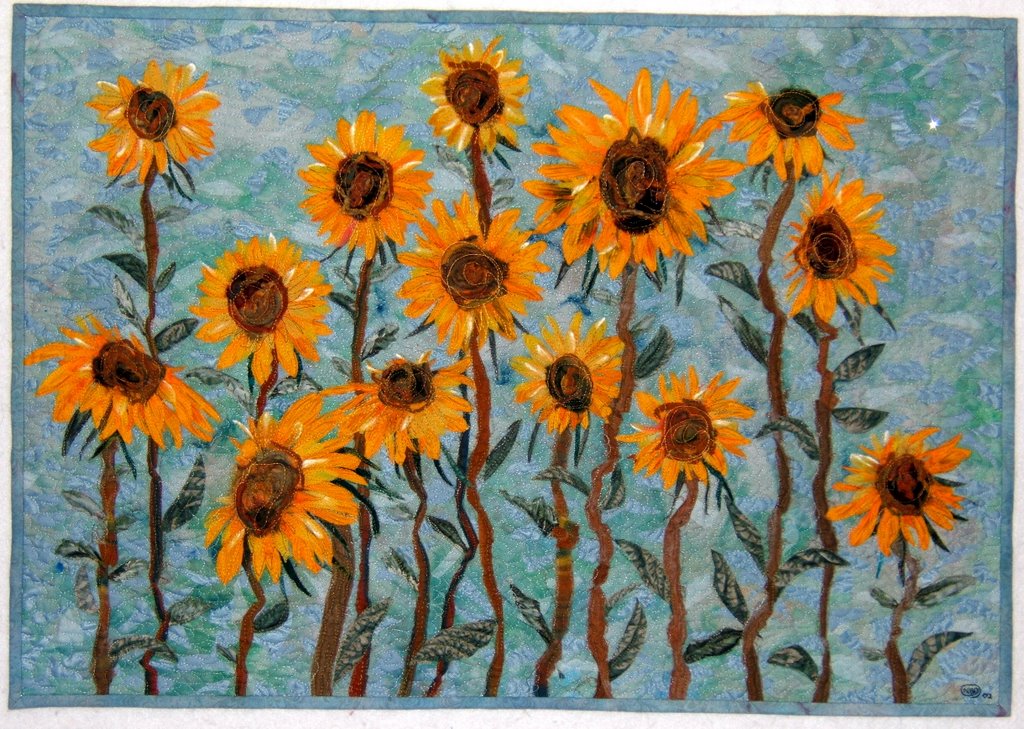
This wall quilt, "Courage" was created in 1997 for a young friend as a graduating from college present.
This quote by Anais Nin is embroidered in a spiral in the center, " Life shrinks or expands in proportion to ones courage."
The periods of clinical depression experienced on and off for a number of years by my friend are represented by the frayed raw seams on the front surface of the quilt. The joy and positive adventures I hoped she'd find are portrayed by the sparkling jewel-like colors in the outer portions of the connected rings. For the most part, I think her adventures in life so far have been in the outer ring.

It's hand quilted. This photo makes me miss those days of sitting in pleasant, quiet places stitching for hours.
Here's a photo of the backside.
The last post as well of this one feature quilts made in my early days of quilting. This happened because I had to move the binders in which I keep the information about the quilts I've made. Pocket pages hold the drawings, templates, photos, and info that pertains to the creation and finishing of each quilt.
I scanned the drawings and photos of this quilt on my computer to get the photos here on my blog.

I had forgotten this was inspired by Doreen Speckman's "Peaky and Spike" pattern that I saw her present on "Simply Quilts". Can't recall if I bought her book or checked it out from our guild's library.

Here's a photo of my design wall that shows fabrics being auditioned.
I still work this way ... making a loose sketch that's not too detailed filled in with general hues and values and then working the details out on the design wall. This method of designing is more dynamic than planning every detail and making all the decisions on paper. The time or two when I have done ALL the planning ahead, the projects never got made ...for me, the adventure of creation was done by then.

Pulling out those binders happened at a good time. I feel as though I'm "on hold" after the completion of the prairie flower quilt ... that I need to take time for contemplation. While they are out, stay tuned for the presentation of more quilts from the early days of my adventure into quilting.

Saturday, March 28, 2009

Pounded Leaf Piece

Remember this piece of muslin with leaves pounded into it? I have backed it with a thin layer of batting and embroidered many seed stitches between the leaves.
I pieced the background fabrics that had been chosen to showcase the leaves. Then I machine quilted it.
Yarns were also couched to the striped panel to give the effect of a stand of saplings. The loose ends will get trimmed away after something gets couched along the horizontal seams above and below that section.
The leaf piece was added to the background and I machine quilted around the individual leaves. Now I'm in the process of add many more seed stitches that pass through all the layers and spill off the muslin panel onto the background.
To view the beginning of this piece as well as other work that incorporates pounded botanical materials click on the label at the end of this post.

Monday, February 23, 2009

I'm Done

"Imagine Monet" is finished ... I think.
Imagine Monet - 30" x32"
The binding and hanging sleeve are sewn in place. A bit of work with oil stick pastels has been added. There is definitely a tree standing on the right side. The trunk at the bottom was filled in by shading with black and gray pastels.
The pink and orange to the right of the couched yarn is added pastel work as well. I also strengthened and lengthened branches at the top. You can also see the added blue and violet pastels along with a bit of branch drawn in the top corner of that right border where it had been just background. To strengthen the illusion of a tree, I lightly drew dark broken lines in the center panel.
I thought I'd share the sample used for trying out ideas and different quilting threads and pattern as well as for getting the tensions adjusted on my machine for the stitching. It's a sandwich made with the same materials. You can see that at one point I considered coloring some of the leaves in my quilt pattern. They looked good, but I opted to keep the spaces open.
I use oil stick pastels to accent and shade many art quilts. They are heat set which also melts them into the fibers. But to have a heavier coverage of pigment requires more of the pastel on the surface. It concerned me that the colors may rub off onto other surfaces ... specifically hands and other quilts.

I did a research online for information of how artists set them on the even less porous surface of paper. The brand of fixative that tested as the best to "fix" pastels to paper was Krylon. Other brands of spray fixatives didn't set the pastels as well ... they more easily flaked off the surface. A number of fiber artists use Workable Krylon. I've discovered a Krylon spray that is UV-Resistant and is non-yellowing. To quote the product information:
It is a clear acrylic coating that provides a permanent, protective coating which protects art, crafts, and valuables against harmful UV light rays. Use to protect photography, watercolor, fabric, display materials, pencil, charcoal, florals, and more. Moisture-resistant and smudge proof.

There are strong cautions about spraying this product without using a face mask. One of those layered paper ones works well. It's also a good idea to spray outdoors.

Sunday, February 22, 2009

"Getting There"

Wow! I'm surprised and pleased at the attention this quilt has gotten. A big "thank you" to all who have responded with comments and suggestions for the dilemma of "am I done?".

I very much liked this piece as it came together, but there was the pestering question about how the center was "being read" ... how it related to the bold flowers. The more I looked at it, the less I was enamoured ... the more that question niggled around in my head.

Whenever this happens , I know I'm not done ... that the piece requires something more, but what? Often, possible solutions rise to the surface of my mind during sleep. When that happens I can hardly wait to get to the studio to try my new idea.

This morning I woke up with a clue as to what is bothering me about this piece. Very possibly it's the orientation. In my mind, while creating the center piece the red and yellow areas were flowers while the blue and white was distance and sky which made even the thought of rotating the piece not even a consideration. Although, I had turned it upside down at one point to confirm which way was up, a vertical orientation instead of the horizontal landscape one never entered my mind. So anyway, I hurried to my studio to rotate it one turn.
Amazingly, how the center piece "reads" changed tremendously. It no longer has the feeling of deep distance, or "a hole" as I referred to it previously. It has come forward to work better with the up close border flowers. Now the yellow has become tall shrub flowers in the sunshine and the white just a nebulous corner. I'm also seeing that previously horizontal fragmented limb as an upright tree ... mmmmmmmm.
30"x 32"
I had made what was the bottom border wider. That makes for another dilemma ... can that wider border remain on the left side? In the first set of photos a strip of the binding fabric is pinned where it would be cut to make it even with the other three. I'm looking at it on my design board without the binding ... and it's growing on me. I think it can stay wider than the other three sides.

Oh, and it now has a title "Imagine Monet".

Am I Done?

All four border pieces are quilted, the yarn is couched over the seams, and several choices of fabric for a 3/4" binding is being auditioned. I also filled in color with oil stick pastels to extend flowers across seams in the border. It's looking good. However, I'm having the problem of deciding what more, or if any more, is needed in this piece.
32"x 30"
I chose the strong pattern of water color flowers with the same coloration in a wide border to balance and compliment the center. But does it? The quilting patterns help to unify the two parts. Is it wishful thinking on my part that it's finished? Am I too attached, too much in love, with that center piece the way it is? I like the branch with its implied extension across the width of the quilt as well as the angled sweep of flowers on the vertical. Does it need something more? The center piece is about air and atmosphere. That aspect is reinforced by the variegated yellow and green yarn that is slightly fuzzy plus the flowers floating on the light valued background in the borders. But does it work to have "distance", a big hole, as the focal point? Am I done?

Saturday, February 21, 2009

Newest Piece

It's time ... past time in fact ... that I get my quilt entries going for this year's Smoky Mountain Quilt Guild show. This is one of two hanging on my design wall.
The center panel was done in 2002. It is one of three studies I made trying to get the effect of what the impressionist painters achieved ... specifically Monet. I blogged about those studies here. This was the last and most successful one ... and my favorite.
For years I thought that it could stand alone and if I'd just give it a finished edge it would be DONE. Several weeks ago I dug it out and pinned it to my design board to remind me to do just that. However something was niggling around in my head urging me to try to expand on this smallish piece (20"x 17"). I remembered that a number of years ago a friend had given me the leftovers from custom-made drapes which featured beautifully "painted" flowers. It took a half day of sorting through my stash to locate, but it was worth it. It co-ordinates with and expands that piece beautifully.

Because the center piece is already quilted, the four floral borders are each machine-quilted separately. The hanging piece of yarn is being auditioned as the one to be couched over the seams that join the borders to this "ortwork" center piece.

Sunday, November 30, 2008

SOLD!

Woo Hoo! Each time a piece of my art sells I feel great excitement that someone has appreciation enough to spend their money on it ... especially in this economy.
Vincent's Flowers - 33"x23" - 2002
As I've stated in my sidebar, I don't make art or quilts to sell, but I do sell ... meaning I create whatever pleases me rather than what either I or a gallery owner/curator thinks will appeal to buyers. I realize how fortunate I am not to have to make a living from my creations ... that I have the freedom to go my own way.

This piece sold from the Cliffdweller's Gallery on Glades Road in Gatlinburg, Tennessee. It, along with nine other quilts, have been there since my weekend in the mountains a few weeks ago. One of the owners knew of my work and requested that I bring quilts to present to her other five partners. All of them enthusiastically accepted my art quilts to exhibit and sell in their gallery.

It pleases me that there are no rolled up quilts stashed away in my closets (except for the one that alternates on the wall in my living room with the other one I cannot bear to part with). All my creations are hanging in galleries in Tennessee, Michigan, and Illinois. Woo Hoo!

To read about my creating "Vincent's Flowers" go here.

Tuesday, November 11, 2008

Leaf Piece Has Begun

This is the arrangement hanging on my design wall. I'm studying the proportions of the main section plus the angle of the newest piece with the pounded leaves that was begun in the mountains about a week ago.
The dragonfly piece at the top is a strip of upholstery fabric given to me by a friend. The edging with glass leaves was another gift from someone who knows I like to use bits and pieces. Both of those are a bit longer than my arrangement so there's room for adjustment.

The large piece with the black leaves is linen that I discharged a number of years ago. Real Maple leaves were scattered across it and then a strong bleach solution was spritzed over all. The bleaching action was stopped by immersing the fabric in a bucket of vinegar and water. At that time I discharged all the yardage I had of this linen with various patterns, some of which was used in "Come With Me to Kasbah". I love the copper color of the bleached areas. I had gone back to the store to purchase more, but it was GONE.

The vertical rectangle is one of five pieces I fabricated a year ago. Here are the other four pieces.
When we were in Memphis for Thanksgiving I had found wonderfully huge leaves with strong veins along the bank of the Mississippi River. They were too dry for pounding an image out of them so I did rubbings with oil paint sticks. After heat setting the leaf images the fabrics were saturated with water, then each was crumpled in its own pie pan and dabbed with acrylic fabric paint and left to dry. This method allows most of the pigments to migrate to the peaks of the folds giving those wonderful natural lines. There's room for more manipulation in this process. I'm sure I adjusted those wrinkles after a day and spritzed more water for more pigment movement.

All those pieces had been accumulating in pile for a year just waiting for the final element and the right moment to "become". There are quite a few pieces from that pile not being used and I think they'll get put away to make room for the other piles of possible projects stacking up in my studio.